i have already surpassed my layout count in 2009...
... so that's pretty sad as far as 2009's scrapbooking goes. : / oops! i blame it on cards, classes & general creative laziness. this year is definitely feeling way more inspiring! not that there weren't fun things in 2009 that i totally spaced on scrapping, but i can always go back. here are some more layouts to add to my 2010 layouts folder.

this is kind of a junker layout, one of those ones you do when it's been a while since you scrapbooked and you have to get your legs. the photo is one rhian took of me on my last full day in europe. we went to walk up and down the hills surrounding a couple of the bays in wales and it was really gorgeous, a perfect, reflective last day. this was for the sketch challenge we're doing at the store each month, but although i like bits of it, it wasn't doing it for me. so i made another one...

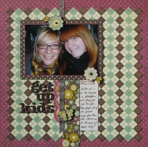
... this one is more like it. i'm not usually a butterfly or floral girls, but something about this boysenberry, brown & chartreuse struck me as necessary. plus i pretty much die for these dark, dark brown glitter thickers that came out with the "dear lizzy spring" line. kristina and i up to trouble as always, this time was going to see the get up kids at my favorite venue in philly for sing along fun, nostalgia & meet ups. isn't it funny how different two layouts can look even though they are both based on the same sketch?!?

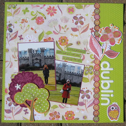
love these shots rhian and i took of each other crossing dublin castle grounds, and with the crazy green grass i had the perfect excuse to use "green at heart"! i had posted this on the store blog with a little tip about using the hambly rub-ons on a like colored paper for a cool clear embossed look, the doilies are the best for the tone on tone look. also, love these white puffy thickers, one of my all time favorites!
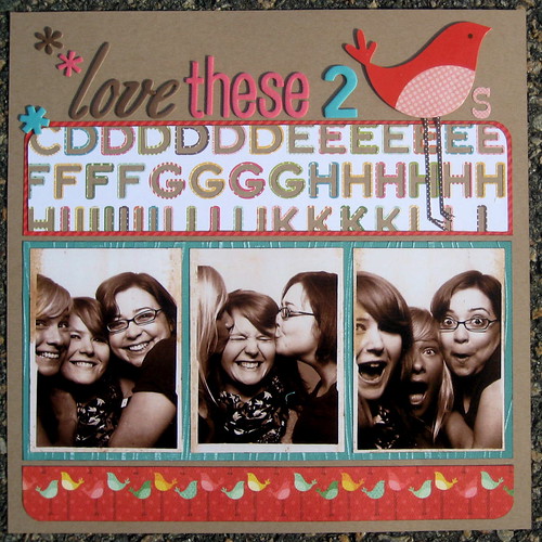
this is another layout for the store blog's tip of the week. i peeled the backing off a set of october afternoon alphabet stickers from the new "fly a kite" collection and stuck them to a sheet of kraft so that i could cut them up to use as embellishment & background and i can also see the letter stickers better without the backing! these photos are blown up photobooth shots from the first time the k's met (kerry & kristina), i seriously do love these 2 birds. i also used the awesome new cosmo cricket core impressions paper (teal, sanded woodgrain yum!)
hopefully the layouts and creativity will keep coming.


2 comments:
Get Up Kids show? One of the most memorable of the past 12 months for me. So good. I might need to have a copy of this layout.
Also...Kerry in Crooklyn now! Both Ks are pretty kool kats, I can say without a doubt.
these are awesome girl! glad you are feeling so inspired! :) blame it on love?! :)
Post a Comment