some more crafty
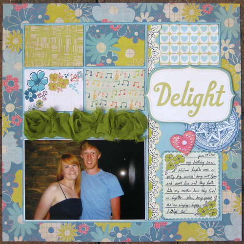
this is my layout for our layout sketch flyer at the store this month. this picture from my birthday dinner seemed like the perfect fit for the brand new "indie girl" collection from sassafras. i'm not usually a vintage flowery kind of girl, but there's something about these colors that make me all lovey for it! plus, i even used a precious 6 inches or so of my webster's pages bloomers! can't wait for the new colors to come out for the fall!
this was a really fun experience, getting to watch the 4th of july fireworks from the top of the fire engine, all cuddled up sitting on the hose bed with my sweetie. you can't really tell from this picture, but i also used one of my favorite glimmer mist colors, "graphite" on the scalloped layer of the triangle banner. these maya road triangle banners are the best because you can make them match whatever theme or color scheme you want, they don't have to be girly!
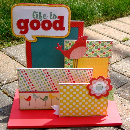
i just taught this class a couple of weeks a go, so i haven't had a chance to put pictures in it yet, but i'm really into these mdf photo displays from kaiser.
just a quick, fun little cutie from my "olivia" paper pad class. grey & pink for baby girl stuff = love.
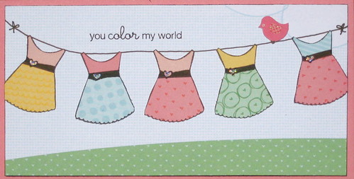
this is not my normal style of card, but i have to say i love how it turned out. i just stamped and cut out all those little dresses and was inspired from there.
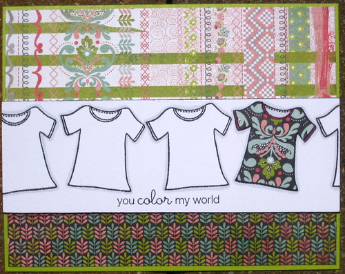
this is almost like my more traditional (for me) take on the card above. and another one from my "olivia" card class.


No comments:
Post a Comment